Mat Maitland is the visual artist and Michael Jackson super fan chosen to create the cover art for his idol’s second posthumous album, Xscape. A part of Big Active, the art direction and illustration agency, Mat worked on the UK campaign for Sony Music.
Creative Direction by J.P. Robinson at Epic Records. Art Direction and Design by Mat Maitland at Big Active. Cover image by Mat Maitland at Big Active, featuring an original photograph by Bill Nation.
When did you first become a Michael Jackson fan?
I became a fan when I was about 13 years old, around the time of
Please
Log in
to view URLs that have been listed here. It's free and quick.
. His impact on me still echoes in my life because he captured something inimitable and enigmatic, a quality which has made him a legend and one of the world's greatest cultural assets. Nobody has achieved what he has. I went to see him on the Bad Tour in 88 and again for Dangerous, both at Wembley Stadium. I have all the books, biographies, vintage tour shirts and even placed a bid to win one of his hats at a fan club convention in London, but got outbid just before he made a surprise appearance with Uri Geller and put a halt to the auction.How did you approach the cover art?
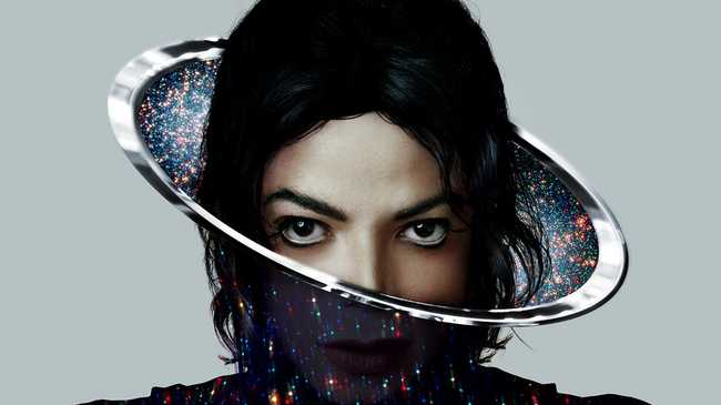
The principal theme is the eyes and I guess the key inspiration is the Dangerous cover, which I absolutely love. The challenge was to create something that would look contemporary and simple. I wanted the established and the fresh to exist together. J.P. and I also discussed the music and how it represents a celebration of Michael's musical heritage and its future. This was also one of the main driving factors for the artwork.
Where did the different elements of the cover come from?
My imagination.
When was the original picture taken?
The cover is based on a photograph by Bill Nation, I think from the late 90s or early 00s.
Michael by Bill Nation, 1997
What does the cover represent?
I wanted to create an image that would be all-encompassing, something that would trigger thoughts of Michael Jackson being omnipresent and with no limitations. I was drawing parallels between his new music being released now, but also hopefully inviting the viewer to think about his universal legacy.
When you look at this cover, what emotions do you get from him? Michael's eyes were extremely expressive yet hard to read.
Yes, it's true. It's a truly enigmatic look. I find strength and vulnerability in equal measures.
Did you consult any old quotes of Michael's about his taste and aesthetic before designing the cover?
After more than two decades reading everything Michael Jackson related, listening to his music and watching his videos, I didn't feel the need to revisit old quotes. He's already ensconced in my head!
What would Michael have thought about the cover?
Well, we'll never know that, it's not for me to say. I hope he would have loved it.
Which MJ cover is your favourite and why?
Dangerous is my favourite cover. Off The Wall, Thriller, and Bad were great but those were using quite straightforward images of him. Dangerous was far more personal and drew on the mythology of his world. The image literally depicts a fantasy 'Michael Jackson' circus ride, where you are almost being invited to buy a ticket, jump on board and explore his world - and the album. It's as though the surface of the image acts as a mask to the thrill ride behind, which is more gothic and scary. The image was painted by Mark Ryden, with art direction by Nancy Donald. It came out in the age of compact discs, which makes it a refreshingly ornate cover for its time.
What aspect of Michael's character and universe fascinates you most?
To me, Michael Jackson is a master of imagination, who drew a veil of dreams over reality. The weird and wonderful world he immersed himself into, combined with the amazing music he created, all contributed in making him compelling and the ultimate entertainer.
Visually, what was so unique and captivating about Michael's aesthetic?
Visually, Michael Jackson was exhilarating. He was wondrously expressive through clothes, dance and videos. It was all about dramatic power and creating narrative impressions. He also projected an otherworldly and mysterious presence, which made him extremely fascinating. He left a style legacy which continues to influence people today - the single white glove, armbands, sequins, red leather jacket, military style outfits, slim-line silhouettes, fedora hats, white socks and loafers. He was really clever in using things from the past and making them his own, often drawing on Old Hollywood icons and films, something no one else did at the time.
Do you have any favourite MJ looks?
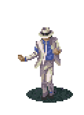
There are so many iconic looks. I thought he looked amazing in This Is It, the film, where he explored the Balmain vision with all the super sharp shoulder jackets. His other outfits in the film were also super contemporary: the Tom Ford tuxedo, skinny orange Dior Homme jeans, and gold sequinned Alessandro Dell'Acqua trousers. The costumes planned for that tour looked incredible, particularly the Billie Jean look, which consisted of a jacket, tuxedo trousers, ankle socks and a single glove, which were supposed to light up using a new kind of LED technology, or the white crystal outfit with skyscraper shoulders. He was bringing a new aesthetic to life.
What about his off-duty looks?
I love his everyday look around the time of Bad. There's a photo of him in Westlake Studios where Bad was recorded: he's looking casual and really cool in a black fedora, Ray-Ban Wayfarers, a red velvet shirt, black trousers, a gold belt buckle, and black loafers.
In your opinion, what's the best Michael Jackson short film?
Please
Log in
to view URLs that have been listed here. It's free and quick.
is definitely one of my favourite Michael Jackson videos! It has so much to say about celebrity culture and directly tackles tabloid reports on his supposedly bizarre personal life. It is littered with references to the wild rumours that dogged his life, but he makes fun of them with great wit. I guess the amusement park ride is emblematic of the machinations behind the star system. It shows us how threatening it can be. The video is a collage like animation, which is one of the main reasons I love it as it echoes certain elements of my own illustration work. I often think about the link between this video, which was the last song on Bad, and the Dangerous cover image, both depicting a surreal fairground ride.Please
Log in
to view URLs that have been listed here. It's free and quick.
Please
Log in
to view URLs that have been listed here. It's free and quick.
Credits
Text Anders Christian Madsen
Creative Direction by J.P. Robinson at Epic Records
Art Direction and Design by Mat Maitland at Big Active
Cover image by Mat Maitland at Big Active, featuring an original photograph by Bill Nation.
It's fair to say this is an interesting piece. Lampshade rings a bell. Not the worst cover we've ever seen - but not the best! Thoughts?
Source:
Please
Log in
to view URLs that have been listed here. It's free and quick.
/
Please
Log in
to view URLs that have been listed here. It's free and quick.